Five Web Design Tips to Improve Your Blog
/I have not been in the blogging game for too long, but I do have quite a bit of experience when it comes to design, and how to make a well-designed website. So today I thought I would share five tips from a designer that will help make your blog more visually appealing, and possibly help you gain more views!
1. Use High Quality Images
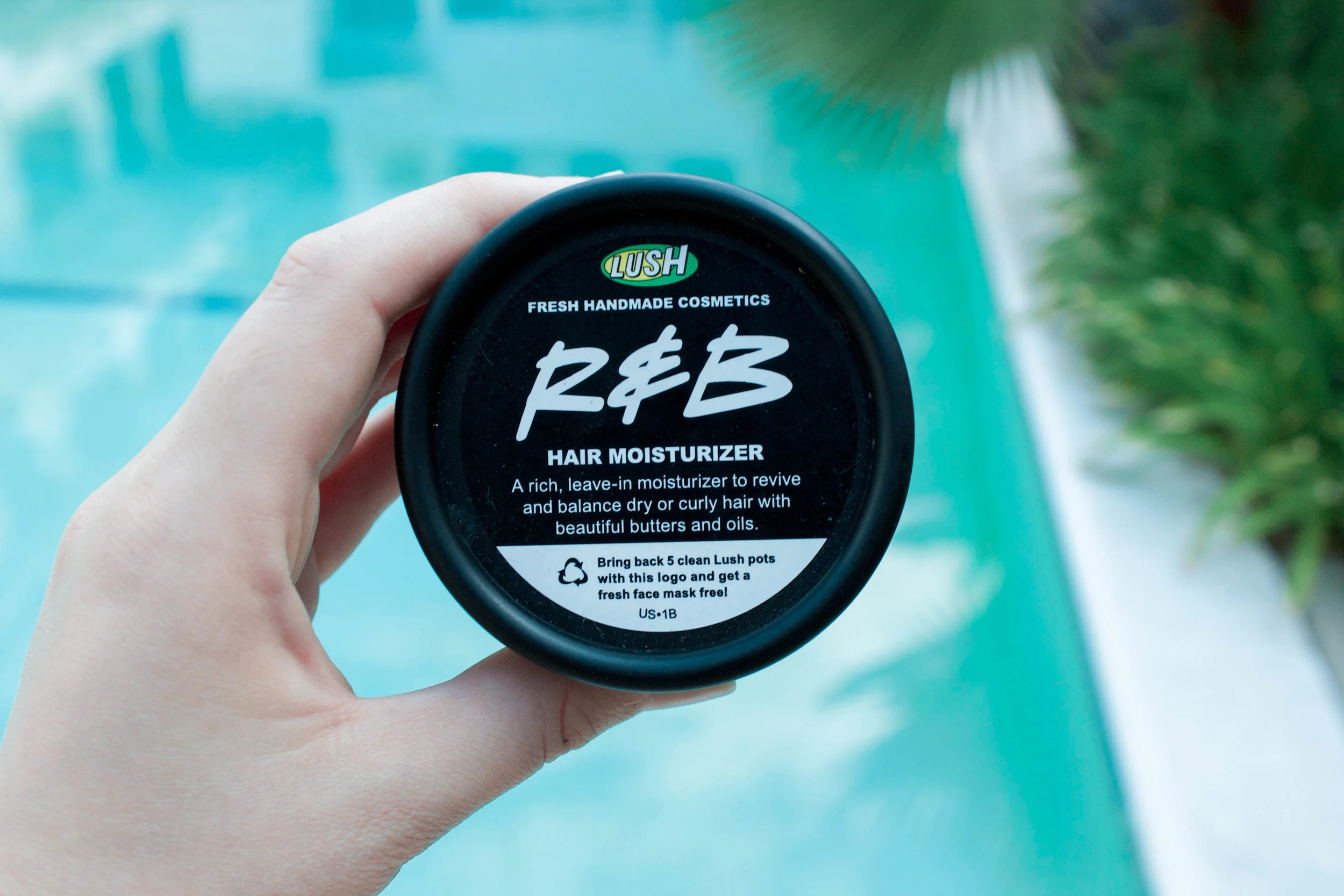
An example of a product shot I took for one of my "Favorites" posts.
I cannot stress this one enough. One thing that will instantly turn me off personally from reading a blog is having low-quality images both on the site its self and within the blog posts. I'm a very visual person, and so if I click on a blog post that has no images, or really poor ones, it doesn't matter how good the information is, I will most likely not stay. Not only can images throughout your post help break up information to make it easier for your readers to digest, but it can also add your own flair and creativity as soon as someone clicks on your post. Also depending on the post, images can be crucial. For example, if you are a fashion blogger, you need to be able to have good images of the clothes you are sharing in order for people to be able to get a sense of your style.
Now, this does not mean you have to become a professional photographer. There are so many ways to either get good quality images or improve your own. If you just don't have the time or ability to take your own photos, I would highly suggest using a stock image website. There are so many good ones out there that are either very cheap or free, so do some research to find a good fit for you!
As far as taking your own photos, here are a few simple tips to make sure you get some good shots to use. One tip is to always try to shoot your images in natural light. This means shooting outside or by a window during the day. Natural light, as opposed to florescent, will instantly make your images look higher quality, and will make editing them so much easier. Also, make sure you pay attention to how you frame your images. Center your photo's focus or use the rules of thirds to make it more interesting. Another thing is paying attention to your backdrops. Is there a big trash can in the shot of your cute outfit? Move it before you take the photo. Simple things like this will go such a long way, just make sure you take your time and get the images the way you want them!
2. Account for Different Size Screens
This is probably something bloggers just starting out may not think about when designing both blog posts and the site its self. People are going to be reading your information on tablets, desktops, their phones, and various browsers. This should be taken into account when creating your content. For example, if your sidebar contains very important information that you want your viewers to see, then make sure you take that into consideration when looking at your site on your phone. Most sites will default the sidebar to have all of that information go to the bottom of the page, so it will be the last thing viewers see if they even make it down that far. If that is not what you want, then change the settings or code on your site to put the sidebar information first when the screen is minimized.
Luckily now, most website building sites such as Squarespace and Word Press will account for that for you and will adjust your pages accordingly to the screen. But even with that help, some things can still come out incorrectly on different screens. An easy way to test this is to just minimize your screen slowly, and see how the page looks at various sizes on your desktop. Then you can adjust accordingly.
3. Create a Hierarchy With Text
Now if you've read some of my Binge Worthy blog posts, you will know how long some of my posts can get, and there is nothing wrong with that. If people are interested in the topic, they won't mind reading a longer post. What they will mind is if your post is just one giant page of text, with no sections or breaking points for their eyes. As I said above, one way to help break up the text is to use images. But another way is to just be conscious of how you size your text. In today's world, people want to get information quickly, and coming up with a hierarchy for your text can help that do that by allowing them to skim the information for what they are interested in. There are a few ways you can use text to your advantage.
The first is to use different sizes and weights of the same fonts. When I write my Binge Worthy posts, I have a system to break them up into sections, which I differentiate with various size text. For major sections such as Why You Should Watch or Discussion Zone, I use the largest size font available in my Squarespace fonts. Then I will even break down those sections into smaller sections which I differentiate using a slightly smaller, but italicized font. Doing small things like this will allow your readers to take in your information easier, and help them navigate your posts better. You can also try using different types of fonts, but I would say do not use any more than two or three different fonts in the same post.
4. Make It Easy to Navigate
No matter what type of website you have, a blog, online shop, portfolio, etc. you need to make sure it is easy for people to find the information they are looking for. One easy way to do this is to add a search bar to your site, so they can just type in what they are looking for. You also want to make sure to come up with categories for all of your information to be sorted into. For example, here on my site, my blog is categorized by Design, Entertainment, Travel, and Lifestyle. Each blog post I do ends up under one of those categories. The categories are also then split into even smaller categories which you can find in my sidebar to even further narrow down your search. I also include links within my posts to other areas of my website with similar information, and summaries at the bottom of each post with links to other similar posts, to keep people engaged with my site as a whole, not just one post or page. You want to make sure things are labeled clearly, and effectively to give your viewers the easiest possible time using your site.
5. Be Purposeful With Color and Font Choices
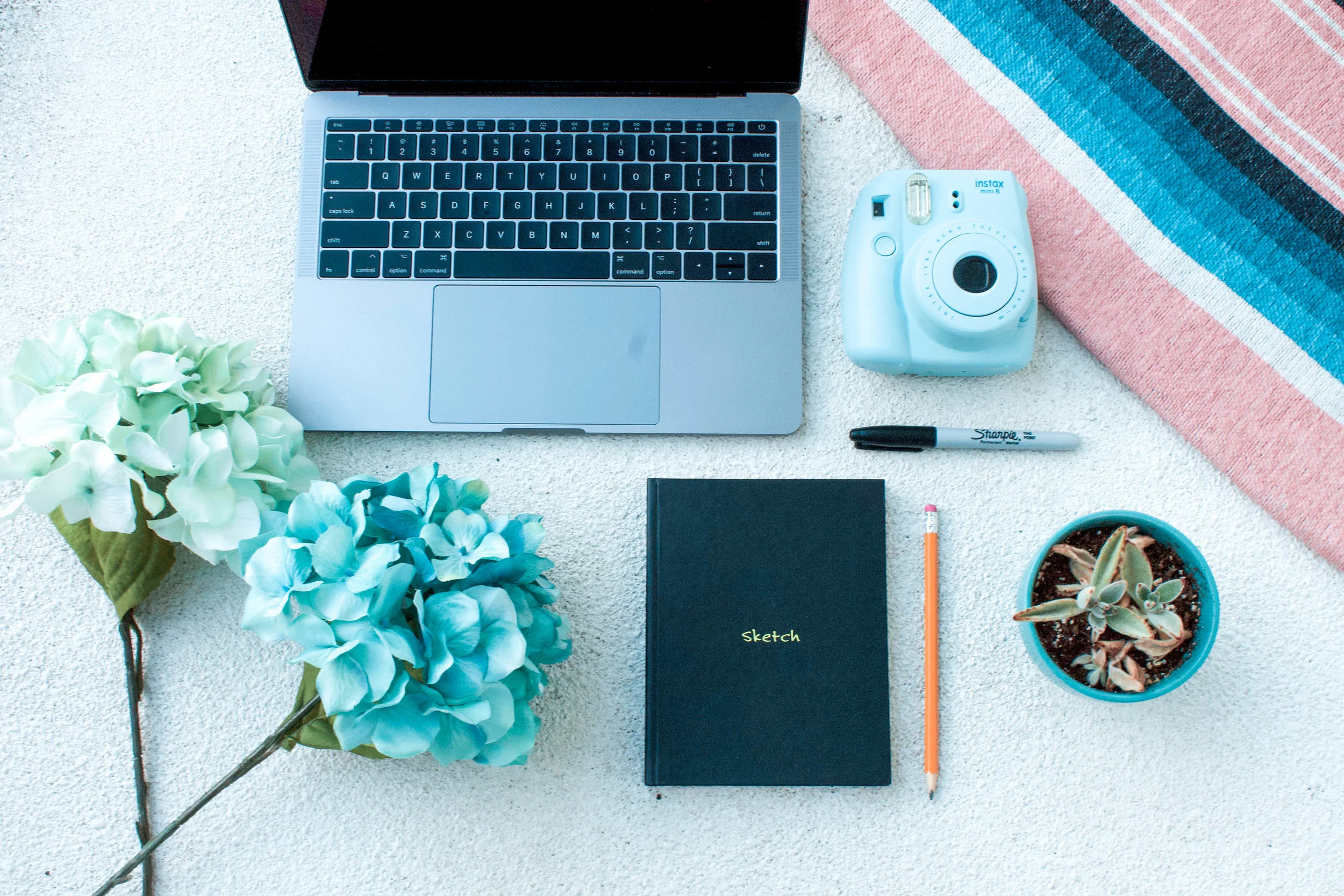
An example of a mood board for your site.
This one kind of refers to your site as a whole. You want to make sure you are intentional and consistent with the fonts and colors you choose. When you first create your site I would recommend choosing four to five complimentary colors, and up to three fonts, that you will use consistently throughout your site. This way your site will start to have its own unique look that will make it instantly recognizable to your viewers. It will also help it to look clean and organized, and pleasing to the eye. If you want ideas for color palettes, click here to see my Pinterest board which has some great color palette inspirations.
And there you have it! Five tips to help up your website design game. I hope that these tips were helpful to you, and if you liked this type of post, give it a like! And if you have any thoughts or questions about website design, let me know in the comments below!


